Did you know that the amount of milk given by a cow depends on the number of days since its last calving? A plot of this correlation is called a lactation curve. Read on to find out how do we use Apache Spark and D3 to find out how much milk we can expect on a particular day.
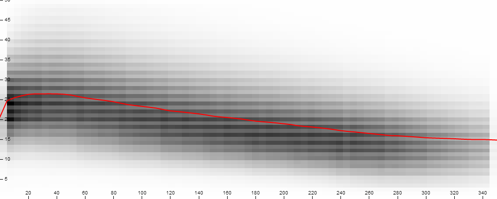
Fig. 1. Milk yield per day.
Background — a lot of cows
Recently, ADA Lab has started a cooperation with the Polish Federation of Cattle Breeders and Dairy Farmers (PFHBiPM). One of the goals of our project is as simple as that: predict how much milk will a particular cow produce on a particular day. It turns out PFHBiPM was doing big data before it was cool: they have gathered 80M records of test milkings from 3M cows over two decades. This created a great opportunity for data analysis.
While drilling through the data, we thought it would be interesting to visualize lactation curves passing certain points on a chart. Just drawing them wouldn't tell us much: they were too numerous. Our goal then was to create an interactive 2D histogram of data points with respect to days after calving and the amount of obtained milk.
Our technology toolbox
We've decided to harness Spark to choose interesting points and group them.
The first idea was to create an app with GUI which at some point would trigger computation on a cluster. However, we have come across a Spark Summit talk about Spark Job Server. It's a piece of software which allows you to talk with your cluster via REST. It would be a shame not to make use of that!
Other pieces were easy to fit: we've crafted a website which uses AJAX to fire Spark jobs and uses D3 to present the results. Working with bleeding edge technologies previously taught us they tend to have sharp edges. Actually none of them were very serious: during compilation Job Server didn't pass all the tests (so we've turned them off...) and AJAX refused to send requests to the remote domain (so we've hacked the Job Server to include Access-Control-Allow-Origin: * HTTP header).
As of D3, we haven't used any off-the-shelf 2D histogram function. Instead we've used range of lower level D3 features: AJAX requests handling, SVG manipulation and chart axis drawing.
The results
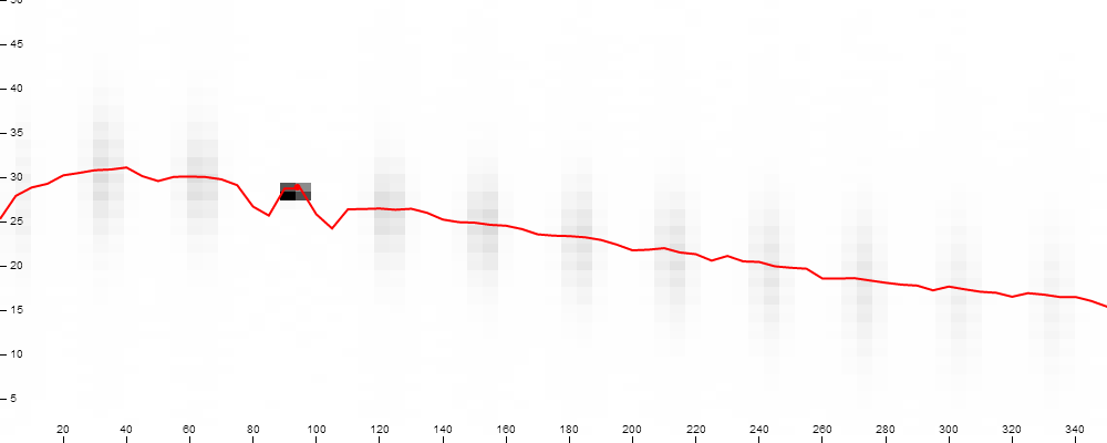
Fig. 2. Lactation curves passing a given point.
Above are the results of our work. Once again we've experienced that a picture is worth a thousand words. X-axis represents days after calving , while Y-axis corresponds to the milk yield. The darker the rectangle, the more data points in it. Red line is arithmetic mean. We'll keep you informed about our milky-project. Moo!